Tuesday, 15 November 2011

Typography & Titles

I have been researching for my music magazine recently, and decided i should focus on typography. I have looked at many magazines and there are a few examples on the left.
I want a unique but relatable title font for my music magazine, although there are many already out there. I believe that the typography of the title can be one of the most eye catching aspects of a magazine, and if you see an interesting one on the shelf in a shop, you are more likely to pick it up.
From my research i have concluded that the majority of titles are at the top of the page, and use quite simple fonts. Some are behind the picture, some are in front and others have their own box seperated from the picture.
In my magazine i want to include an eye catching, interesting title that is relatable and makes you want to read further. I have decided that i will need to put my title at the top of the page because from a practical side of things, it needs to be seen from the shelf. I am going to research further in to different typography for my own music magazine and although i want it to be different i need to remember to keep it simple.


<>

Friday, 11 November 2011

Double Page Spread Research

Having researched double page spreads for when i come to creating my own, i have discovered i like a lot of them. I narrowed them down to these two favourites. I like them both because although they are different they both hold information.

I like the MCR magazine because it is quite busy. There are loads of pictures all over but in an organised way, which i might like to emulate in my magazine. I also really like the title which is the quote 'We're being the best mcr we can be!'. I like the idea of using a quote on my double page spread as i think its a bit different and engages the reader.

I think that the other double page spread looks really quirky and original because of the mismatched lettering. It also helps draw attention to the page and makes you want to read on. This page has another quote as the title: 'People think im an attention seeker, but im just honest'. This snippet makes the reader want to buy the magazine to find out more. i like the one plain, simple image and the bland colours (black, white and red) make the magazine look quite modern and interesting.

Overall, i think that looking at these double page spreads has really helped me and given me ideas on what to do.

Magazine Cover Research

I have been researching different types of magazine covers, and looking at all the mixes. Vogue has so many interesting front covers, and this is my favourate layout. Although it is quite similar to a lot of magazines I like the simplicity as well as the fonts, image and structure. I especially like the 'Change!' part at the bottom of the magazine as i think it grabs your attention. Whilst looking at these magazines, i have discovered some things i will have to put on my own magazine to make it more realistic and proffesional: a bar code, title, website, pricing, date, sub-heading and a suitable image, as well as the information about what goes in to the magazine.

Tuesday, 8 November 2011

Music Magazine Research -Coursework

I have started researching for my coursework. I am creating a front cover, advert and contents page of a music magazine. From my research i have discovered that the central image is very important as most of the focus is on that. The title makes a lot of difference and tells you what kind of magazine it is.

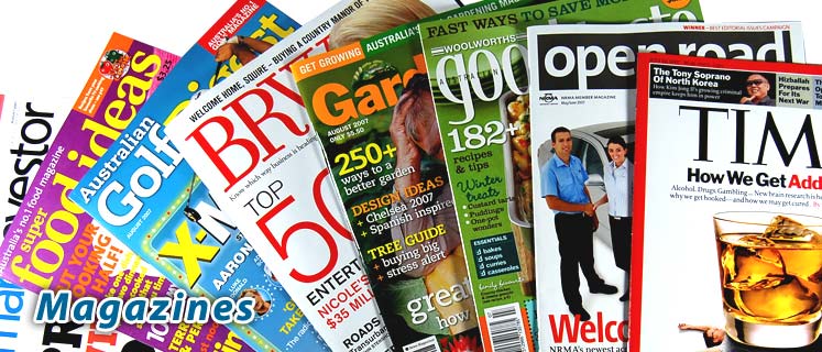
This is a print screen of many different popular magazines that are on the market today. I have included some music magazines as well as fashion and others. I have realised that my magazine must be exiting and original because a lot of magazines are very similar to eachother.

Sunday, 30 October 2011

Evaluation Of Finished Preliminary Task

I am very pleased with the effect of my magazine cover and contents page and personally feel they both went better than expected.
I mainly used Photoshop but included Word and DaFont. In Photoshop i used the brightness/contrast and hue/saturation tool to make my picture look less dull and more colourful. I also used the text tool a lot, as well as word. DaFont was very helpful for interesting titles and the bar code image. I feel that i have learnt a lot about how to use photoshop over the past few weeks and that i have improved a lot. I think i am now ready to move on to the next big task (a music magazine) and execute it well, knowing many new techniques on photoshop.
I studied and researched many magazines before drafting my own, and decided to make a magazine with a similar style to vogue, because i liked the curly typography and striking layout, although i didnt want to make it so expensive looking. As this is a school magazine, I thought that this would appeal to female college/6th form students because it is focused on fashion at school (you can tell this from the picture on the front cover). Also i decided to make the colours on both the cover and contents page quite feminine to fit with the target audience, and made the contents page fit with the cover by using brick on both. This adds a sense of continuity in the magazine.
I think the strengths of the magazine include the main picture, as it shows it is a fashion magazine and the fonts because they stand out and add interest. Also on the contents page the images are relatable. The weaknesses could include the background  of the front coveras i feel it is too busy. This means its hard to focus on the text/images. As a result of this i attempted to darken/dull the background but could not make it less distracting. Another weakness could be that the contents page is very plain, although i believe it holds all the necessary information.
Overall i am happy that my magazine is suitable for teens at school/college and would sell because it can relate to them. It looks interesting and is the kind of magazine that would stand out in a shop. In future, i can take the skills i have learnt (from mistakes as well as strengths) and make sure i use the knowledge i have gained positively.


¨

Finished Contents Page

This is my finished Contents Page. I am quite pleased with the overall effect because i was influenced by my front cover. I like the way the two are linked together and am happy with my finished design.

HOW DID I DO IT?
-The background was found online as a border, but i edited the brightness/contrast so it looked similar to my own on the front cover. I made the fonts the same as on my front cover too, which means the two link and are similar.
-I used two pictures, but instead of using unrelatable ones i tried to take pictures that would relate to the magazines audience. I think these two pictures do that well.
-Down the left hand side I have placed the titles of articles, and their page numbers. I made the font of the page numbers slightly smaller so the articles stand out.I also added a 'NEXT TIME' in a puff which will attract the reader and make the important details stand out, and an 'EXCLUSIVE' written in a different colour which also makes the reader attracted to that section.
Overall i am pleasantly suprised at how my contents page has turned out, and have taken in to account the strengths and weaknesses of the task for the future.

Finished Magazine Front Cover

This is my finished magazine front cover.I am really pleased with the overall effect. To finish off I added text detail all over it in blue, purple and black to add interest and make the reader want to buy the magazine. I used the colours i did because i feel they stand out against the brick wall. I also slightly edited the brightness and contrast because i thought that the bricks were detracting from the image and writing.


The 'Fashion!' subtitle was produced on Word because i wanted it in colour to make it stand out more, and all the other writing was done on photoshop. I decided to use the colour white for the 'school fashion special' because the colour stands out against the busy brick wall. i thought that i would focus on 'Fashion' because that is my target audience and  it also fits with the model.
 I got my main title from DaFont online, and i chose this one because it looks like it has been printed on to the wall and i also think it looks fun and interesing. I also used the bar code from DaFont because it was small and makes the magazine look more realistic. I then edited my magazines brightness and contrast because i thought it would make the magazine look more realistic.
I added the price, date, website and bar code to make the magazine look proffesional. i got the bar code from DaFont. I also edited the brightness/contrast and hue/saturation some more at this stage, to make the magazine even more proffesional and 'glossy'.
I took the original picture on a good quality digital camera, and although I was worried the final image would be pixilated, it was not. I rotated the image once it was in photoshop, and i chose this image because it seemed to go well with the target audience and i liked the background because it stood out.