Friday, 19 April 2013

CD back covers

Here are a selection of CD back covers that i have looked at. I really like the one with the central font and think i will emulate that for my own back cover. Researching these was really helpful and i have learnt a lot. By looking at these i have found that there are many different ways of laying out the text and image. I love the Wombats CD layout and the way that the image is using a photo within a photo technique is really interesting and has an eye catching effect. Rihanna's album uses a faded picture so that you can focus more on the writing and not be distracted by the image. The beatles album back cover is one that i really like as it has half the page as the image and half the page as the writing and i think this is an interesting and well thought out technique. Overall looking at these CD covers has been really helpful and i have learnt what to put on the back, for example the bar code, and logo's of the company.


Digi Pak Research


After looking at several Digi Paks, i have decided that the similarities between them are that they all have a  continuous colour scheme, and everything goes together well. For example, Rihanna's album has red lipstick and red hair, and inside she has a photograph of her lying in a bed of red roses. On the CD there is a rose. They all link together. Same with The Script's album. This is something i will take in to consideration when designing my own Digi Pak.

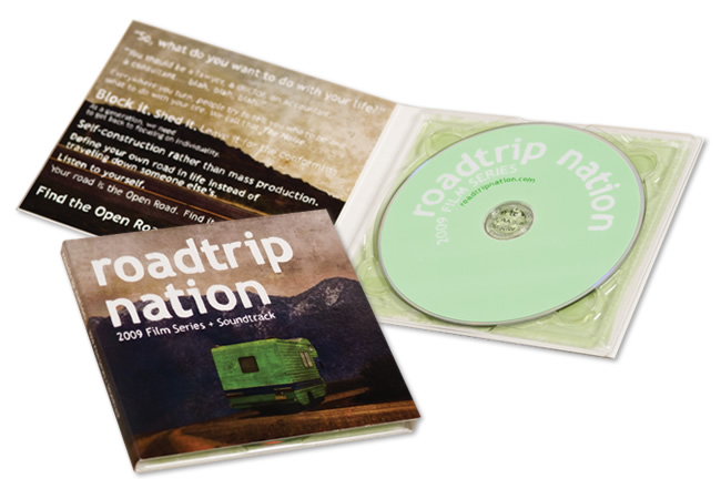
A DigiPak

Digipacks are a type of CD packaging that can flip open like a book, or can have three parts, so that one portion of the packaging opens to the right and one to the left with the CD in the centre. Usually, the portion of the digipack that hold the CD is made of plastic like a traditional jewel case CD - the plastic part is simply attached to the paper background.
Digipacks were first created by MeadWestvaco, and their product, Digi-Pak is trademarked. As the format became more popular and began to be used by more manufacturers, the generic "digipack" came to be used to describe all soft CD packaging. The pros and cons are that they look nice, and many bands and labels like to use them for aesthetic reasons. The three section digipack sleeves opens up more design options because there is more room. However, they're more expensive than traditional liner notes and jewel cases. Digipacks can be more environmentally friendly than jewel cases because they can be made of recycled paper - however, they aren't always in fact made in this way. Also, Digipacks don't crack like jewel cases do, but they will rip and eventually the paper begins to peel apart and separate.
After looking at different types of digi pak, i have decided to create my digi pak similar to the one at the top, the "Boards of Canada" album. I have decided to do this because i feel it's more simple than having many bits to fold out, and so maybe is more eye catching/interesting. 

OUR FINISHED MUSIC VIDEO!


This is our FINISHED MUSIC VIDEO! We are both so pleased with the result, and have really enjoyed the process of creating it. There are obviously some little things that i would change now it is finished but overall i am so pleased and love the message we have managed to convey. For example, i would probably make the flashbacks more obvious although i do like the effect as it is. I really love the quick shot changes and think this creates a great effect.

Finished editing


This second clip is from the finished edit. We have finished our editing and are now colour correcting the different clips to represent past and present. We have chosen to turn the past clips or 'memories' to a blue/purple colour and add some noise (20%) so there is a clearer difference between the two times. Also the blue connotes an unhappy mood and she is unhappy because he is no longer here.

Little Talks Process


Here is a exported version of our music video during the editing process. We have editied over 50% but have some areas still to fill. We have not colour corrected this video yet either, as we will do that at the end. We still have a blank area at 6.45 and we are finding this a challenging area to fill because we do not want the video to become repetitive.

Thursday, 11 April 2013

Editing

We have started the editing process of our music video now. It has taken us a while to get the hang of Adobe Premiere Pro but now we understand what we are doing it is a lot easier. We have put the song in and are editing the clips together. We have decided that because the song is very fast paced we will keep the clips short and flashing to go with this tempo.


This is a screen shot from the editing process. We have now edited just over half of our film together. We have tried really hard to fit the visual image to the rhythm and lyrics. Because of this it has taken a lot longer to edit than we originally thought. We are sticking with the fast and flashing theme of the video clips and have decided to weave in an out of present and past in a dream like way. So far there is a pattern of clips relating to the song chorus/bridge/verse etc. I think it is good to have a pattern because it makes more sense in the viewers mind, especially when the video is quite abstract like ours is.

.