Have you heard of Hayley And The Contours? If not, you will soon! The young, fresh woman-and-two-man band have been steadily rising in the music industry and their new and individual musical talent has drawn in the crowds. The newly released tour dates have sold out after just 3 days, proving that anyone can make their voices heard, if their good enough! We've got Hayley, the fashion obsessed head of the band in for an interview.
Loving the indie inspired outfit today Hayley!
Monday, 12 December 2011

Interview And Double Page Spread Research
On my double page spread i will have to include an interview with my given artist, so have decided to research in to what goes in to an interesting interview, and what kind of questions are asked to keep the reader interested and engaged. Looking at different interviews, i have learnt that an article will normally start with a brief description of what the interview includes and who the artist is. The questions are simple and keep to the point and the majority of the answers are witty, funny or lighthearted, although this does depend on the formality of the magazine. I have noted that the heading and subheading are normally the name of the artist and/or a quote from that artist.

 1) I have taken a liking to this magazine double page spread with the black eyed peas because i am very fond of the layout. The interview is lighthearted and also quite short and the picture is eye catching but also suggests who the main interview is about by fading out the other three members of the band. The interview uses lighthearted questions and answers, and the questions are outlined in bold to separate them from the answers. I also noticed that there is a quote written in the center (in bold) and another title 'Will he, Wont he?' in similar colours to the outfits
worn. The photography is good, showing each member of the band equally and well spread out on the page. I like and will take inspiration from this particular magazine double page spread because although it is quite plain it all fits in to the theme and goes together to attract and engage the reader.
2) This magazine double page spread featuring 'The Vaccines' has one of the best layouts i found. I really like it because of the image, title and interview which is quite informal. It includes quotes and the beginning of paragraphs start with a letter of big fonts and a different colour which makes it stand out and also allows it to be easier to read. The picture is very nice, and shows the reader what the band is all about, including showing musical instruments and the fashion senses, both telling us a lot about them.
In conclusion i like both of the double page spreads i have focused on, and have realized a lot about interviews that i did not know before. I will show what i have learnt in my magazine's double page spread, using and elaborating on the techniques that i have discovered.

 1) I have taken a liking to this magazine double page spread with the black eyed peas because i am very fond of the layout. The interview is lighthearted and also quite short and the picture is eye catching but also suggests who the main interview is about by fading out the other three members of the band. The interview uses lighthearted questions and answers, and the questions are outlined in bold to separate them from the answers. I also noticed that there is a quote written in the center (in bold) and another title 'Will he, Wont he?' in similar colours to the outfits
 worn. The photography is good, showing each member of the band equally and well spread out on the page. I like and will take inspiration from this particular magazine double page spread because although it is quite plain it all fits in to the theme and goes together to attract and engage the reader.
2) This magazine double page spread featuring 'The Vaccines' has one of the best layouts i found. I really like it because of the image, title and interview which is quite informal. It includes quotes and the beginning of paragraphs start with a letter of big fonts and a different colour which makes it stand out and also allows it to be easier to read. The picture is very nice, and shows the reader what the band is all about, including showing musical instruments and the fashion senses, both telling us a lot about them.
In conclusion i like both of the double page spreads i have focused on, and have realized a lot about interviews that i did not know before. I will show what i have learnt in my magazine's double page spread, using and elaborating on the techniques that i have discovered.
The Music Industry
I thought that i should do some research into the music industry because i am creating a music magazine which, in the real world, would be released in to this market. This first bit of information is about how music is sold or listened to in the world today:
Downloads - Both illegal and legal downloads, the most popular site being ITunes.
Physical Items - This can be through the purchase of CD's or records.
Streaming - This is where you can access the music without downloading it, the most popular being Spotify.
Major record labels are the large record labels who own well known artists and promote these to make a profit.
examples of these are EMI , Sony , Universal. These labels also usually own other smaller record labels and businesses.The Independent record labels are smaller labels. Examples of these are679 Artists , Domino and Jeepster.
Downloads - Both illegal and legal downloads, the most popular site being ITunes.
Physical Items - This can be through the purchase of CD's or records.
Streaming - This is where you can access the music without downloading it, the most popular being Spotify.
Major record labels are the large record labels who own well known artists and promote these to make a profit.
examples of these are EMI , Sony , Universal. These labels also usually own other smaller record labels and businesses.The Independent record labels are smaller labels. Examples of these are679 Artists , Domino and Jeepster.
Studying Magazines (double page spreads)

Within this double page spread, the headline reads 'Little Boots'. This is a clear recognition of the artist which immediately tells the audience what and who the article is about. The subheading 'Our favorite new UK electro act', sums up what Little Boots is about and what kind of music she plays.
This is a very similar image of Little Boots to the one in the article, although i could not find the actual one used. The image suggests what kind of music she plays and what she's like. She is looking directly at the camera which is popular in almost all magazines and this particular page is quite plain which allows the reader to focus on the picture not any bright or busy backgrounds.
The articles tone seemed to be quite informal, and was in a large box of text. It didn't have any colour's on the page or in the writing and i personally thought this made it seem quite dull and uninteresting. The layout of the magazine is sparse but does allows you to focus on whats being said.
Overall i enjoyed learning about the different aspects of this magazine page spread because it has helped me with the development of my own.
Tuesday, 22 November 2011
Looking at Photographers
I have been doing some in depth research on different Photographers. This has helped me with my ideas for my Magazine front cover because i now know what kind of look i am going for and how to achieve this in an image.

This first image of a woman holding a guitar is by Peter Krogh, who is an award winning Photographer. He uses all formats of equipment including large film cameras and complex lighting locations. Personally i really like this image and am thinking about doing something similar for my magazine cover, or one of the images on my double page spread.

I have been inspired by this image and think that it would fit in well with my magazine. It would fit well with my indie theme. "The punky, inked boy are all the rage in the industry at the moment" This shows my magazine would be current and 'now' if i used a similar idea.
 This image is one of my favourites and although i cannot find who it is by, i really like it and think i am going to attempt to emulate or take ideas from it. I might link it to music by using a musical instrument or something similar, but overall i love the effect.
 Looking at these photos and photographers has made me think about the positioning and set for my cover and double page spread images. I have realised i will need to adjust my pictures in Photoshop and have been inspired by many of the photos i've seen.


MY OWN PHOTOGRAPHY:
I have taken a lot of photographs for my magazine and my media pack, looking at photographers and artists to help me emulate. I have photoshopped all of these images to make them look like they came from a magazine (glossy, up-market etc) and am very pleased with the results although i am not yet sure i will use any of these for my actual magazine front cover. If my magazine was made then they would fit in nicely amongst the articles. 


Tuesday, 15 November 2011
Typography & Titles
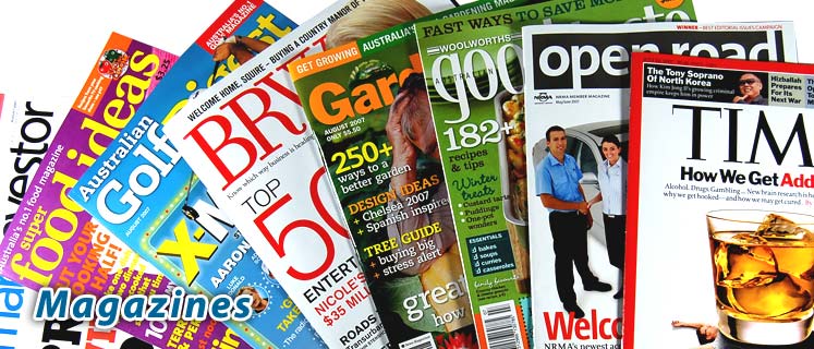 I have been researching for my music magazine recently, and decided i should focus on typography. I have looked at many magazines and there are a few examples on the left.
 I want a unique but relatable title font for my music magazine, although there are many already out there. I believe that the typography of the title can be one of the most eye catching aspects of a magazine, and if you see an interesting one on the shelf in a shop, you are more likely to pick it up.
From my research i have concluded that the majority of titles are at the top of the page, and use quite simple fonts. Some are behind the picture, some are in front and others have their own box seperated from the picture. In my magazine i want to include an eye catching, interesting title that is relatable and makes you want to read further. I have decided that i will need to put my title at the top of the page because from a practical side of things, it needs to be seen from the shelf. I am going to research further in to different typography for my own music magazine and although i want it to be different i need to remember to keep it simple.


Friday, 11 November 2011
Double Page Spread Research
Having researched double page spreads for when i come to creating my own, i have discovered i like a lot of them. I narrowed them down to these two favourites. I like them both because although they are different they both hold information.


I like the MCR magazine because it is quite busy. There are loads of pictures all over but in an organised way, which i might like to emulate in my magazine. I also really like the title which is the quote 'We're being the best mcr we can be!'. I like the idea of using a quote on my double page spread as i think its a bit different and engages the reader.

I think that the other double page spread looks really quirky and original because of the mismatched lettering. It also helps draw attention to the page and makes you want to read on. This page has another quote as the title: 'People think im an attention seeker, but im just honest'. This snippet makes the reader want to buy the magazine to find out more. i like the one plain, simple image and the bland colours (black, white and red) make the magazine look quite modern and interesting.
Overall, i think that looking at these double page spreads has really helped me and given me ideas on what to do.
Subscribe to:
Posts (Atom)