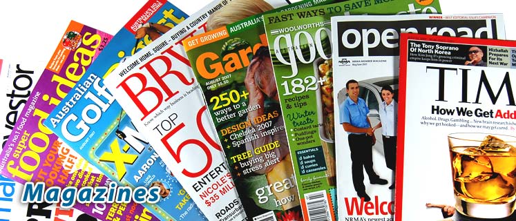
 I have been researching for my music magazine recently, and decided i should focus on typography. I have looked at many magazines and there are a few examples on the left.
 I want a unique but relatable title font for my music magazine, although there are many already out there. I believe that the typography of the title can be one of the most eye catching aspects of a magazine, and if you see an interesting one on the shelf in a shop, you are more likely to pick it up.
From my research i have concluded that the majority of titles are at the top of the page, and use quite simple fonts. Some are behind the picture, some are in front and others have their own box seperated from the picture. In my magazine i want to include an eye catching, interesting title that is relatable and makes you want to read further. I have decided that i will need to put my title at the top of the page because from a practical side of things, it needs to be seen from the shelf. I am going to research further in to different typography for my own music magazine and although i want it to be different i need to remember to keep it simple.


No comments:
Post a Comment