Tuesday 18 December 2012

Emailing the Manager

Before we made our music video, we had to email the manager of Of Monsters And Men to ask permission to use the song. This is because we did not create the song ourselves and have no right to use the song. Here is the email that we sent to the Manager:
From: Poppy Dodgson
Sent: 09 November 2012 12:09
To: heather@esjamanagement.com
Subject: Of Monsters and Men- Little Talks use
Dear Heather,
We are two Media Studies students at Chew Valley School. We are making a music video as part of our A Level advanced porfolio in media and were wondering if we could use Little Talks by Of Monsters and Men as the soundtrack for our music video.
The video would only be for our coursework and not used for any commercial purposes.
Please could you let us know.
Thanks,
Poppy Dodgson and Louise Storer at Chew Valley School, Chew Lane, Bristol, BS40 8QB

Summary of Music Video Research

Now we have finished our research of Music Videos, we have decided to focus on 'Home' by Edward Sharpe and the Magnetic Zeros, and 'Video Games' by Lana Del Ray. Both these videos have got a similar theme running through them, as they are both made up of clips of 'old times' or memories, with a home video feel to them. This creates a really interesting effect and is something that we want to take forward with our own music video. After looking at the music videos we have listed some codes and conventions we want to include to make our video the best it can be:

Codes: The codes of our music video will be to maybe have a deeper or underlying meaning.
Conventions: The conventions of our music video will include a strong storyline, instead of just dancing around etc. We are also going to have two main characters

Our music video's song will be by the band 'Of monsters and Men' and is called 'Little Talks'. We chose this song because it is a really upbeat song which can appear to be happy, but when you listen to the lyrics you realise that it is a very sad song. This is something we want to portray throughout the music video, using flashbacks of a happier time whilst the present is sad. So, we are going to tell the story of a woman who's husband has died, and she is slowly going mad over the course of the video, thinking she can hear his voice. She is having flashbacks throughout the video, and these will be in a 'home video' format to create the effect of memories.

The genre of our music video will be a 'hybrid genre' which is a mixture of many different genres put together. The genres includes indie, rock and pop themes. The general genre of Little Talks (song and video) would be said to be indie as it is not a typical pop song. However there are small themes of the pop genre and also rock too.

The target audience for our music video will be for more intelligent and involved people, who are interested in music videos, moving image and music. The video's aimed at young adults and teenagers who have a strong understanding and interest in these types of things, however people that are not overly involved but simply like the song can still appreciate the video.

The purpose of the music video is to entertain and interest people, as well as intregue them in to listening to the lyrics of the song and becoming emotionally involved in the ideas behind it.

Tuesday 20 November 2012

Script


This is the script for the main task. Because we are doing a music video to a song, this made it quite tricky for us to create a script. What we have done is written up the lyrics, and then added the diagetic and non diagetic sound in to that using colour coding. This will help us clearly see when we must film a flash back, or when the woman needs to sing a line. It also is clearer now what actions we are filming and when these are so we can see what we need to film on the day.

Monday 19 November 2012

Storyboard

For our main task we had to create a storyboard of what we are going to show in our music video. This is going to be very useful because when we are filming our music video we can refer to this plan so we do not forget any shots or parts of the music video.


Friday 16 November 2012

Video Games- Lana Del Ray

This is Lana Del Ray's music video for 'Video Games'. This music video interests me because it has an 'old home video' effect. This is something that we would like to incorporate in to our music video because it is a really nice effect. Lana Del Ray's music video has lots of clips of events that have happened in history, almost like flashbacks. These are constrasted with clips of lana singing to the camera, still with a old movie feel to them.

Little Talks- Of Monsters and Men

This music video is called 'Little Talks by Of Monsters and Men. The video is a mixture of animation and real footage. I think that this effect is a really interesting one but sadly something we cannot achieve for this project. However i love the idea and really like the songs message. I think that the song is talking about a woman who has lost her husband and is talking to him as if she was still there. My group love this idea as the basis for a music video so are going to do some more reseach around it.
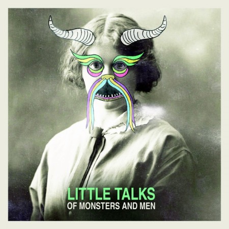
This is the Album cover of Of Monsters and Men's album with 'Little Talks'. The album cover goes with the video, because it has got a real image with animation over the top. This links it with the video as that is what the video has too.

'Home' by Edward Sharpe and The Magnetic Zeros

This is another video i found called Home by Edward Sharpe and The Magnetic Zeros. They say that the music video is a collection of the bands favourite memories. This really shows in the video and is an emotive idea, as the viewer can immediately tell that the mood created is happiness. The song is about how when you're in love the only place that feels like home is when you are together, and this is shown in the music video with the bandmates. Overall i love the mood created by the video and the song.
Above is the album cover that this song was in. As you can see this image goes well with the theme of the video. This shows me that for my album cover i need to take a picture which links with the music video.

Pink- Blow me One last kiss

This is Pink's 'Lyric Video' to Blow me one last kiss.I really like the cutting from photo to photo to make it look like a jumpy video. This effect is something i would love to use in my music video. The video is quite similar all the way through which i think looks good, however the distance of shot changes quite regularly.I think that our video would benifit from an added technique to make it different and interesting, and i think that jump cuts with video would look good.

Music Video Research- Colours by GroupLove

Now we have decided that we are going to make a music video, we have started researching for this. The genre we are looking at is abstract, interesting with a story told through it.We want to create an abstract style video with a deeper meaning underlying which will capture the audience.


We found this interesting video (Colours-GroupLove) and love the tribe theme and the story that is told throughout. We really like this video because it has a strong story line about the man being hung and the tribe together. "Its the colours you have, no need to be sad, it really aint that bad"- the song is saying that life isnt that bad and you are still you. This is a deep and meaningful song with a video that captures the feeling. Watching this video has helped me decide that i wan to create a meaningful video.

Music Video Research

We have decided on Brief 1 for our main coursework which is to create a music video. I have been researching music video's and have found loads of interesting ones. The reason why i have been looking at music video's is because i feel that this will help us when creating our own because we can see what looks good and what does not before we make it. This will help us make our music video better. When we decide on a music video idea we will have to think about the genre, audience and purpose for the music video.

Preliminary Task Evaluation

We have now finished the preliminary task. I personally feel that it went really well, especially for a first attempt at putting together a script, storyboard, and then filming and editing. I like how to the story flows well and the script writing helped this. If i was to remake or improve this footage i would make the pauses between cuts go, and maybe improve the titles and credits to make the whole thing more interesting. Once i am more efficient at using premier pro, i will learn how to colour correct etc to make future films look more proffesional and interesting.

Friday 9 November 2012

Different Shots

Before we created our preliminary task, we wanted to look at the different camers shots and angles. This helped me to understand what effect they have and we were able to practice these angles/shots so we can film our preliminary task in a more proffesional and confident way. Overall i think that this went well, and i now have a fuller understanding of how the different camera angles work. We were also able to try out the editing program- Adobe Premiere.I found the editing very fun, but that it is also quite hard to get a smooth, professional look, however, now i understand Adobe Premiere more, i feel that it will come across in the next tasks i have. Here is the video:

The Talk- Finished Preliminary Task


Here is our finished preliminary task. I am really pleased with the result.

Monday 22 October 2012

BRIEF 1

We have decided on Brief 1:

We have decided this because we really like the idea of making a music video, and because it is the brief that we think we could get the most out of. We have come up with several ideas, but at the moment we like the idea of a abstract/surreal type music video that shows a journey of some description.

Monday 17 September 2012

What have we chosen?- Mindmap

We have looked over all of the briefs and decided that we would like to do either

Brief 1- A promotion package for the release of an album, to include a music promo video together with two of the following three options:
  • A website homepage for the band
  • A cover for its release as part of a digipak
  • a magazine advertisement for the digipak
OR,

Brief 2- A promotion package for a new film, to include a teaser trailer, together with two of the following three options:
  • A magazine front cover for the film
  • a film magazine front cover, featuring the film
  • a poster for the film

We cannot decide which brief to do so have made a mindmap with different idea's to help us decide:


Friday 14 September 2012

STARTING THE MAIN CW!

Passed exams and back for another year! I am now starting the main coursework for A2.

Editing

The editing of the preliminary task has been completed, and it was interesting for me and the rest of the group to learn what was good and what was bad when it comes to editing, and to understand what we have done wrong/right this time so that during the main segment of the coursework we can apply what we have learnt. Overall i think the editing went well and i now feel more confident when it comes to using Adobe Pro.

Filming

We have now completed the filming of our Preliminary task! I think that it went really well, and we remembered all of the important angles and rules, as well as sticking to our script and storyboard.

Thursday 6 September 2012

Script


Here is the script for my Preliminary Task. Writing the script was really interesting because we have decided on a comedy and wanted to make the comedy funny, but when writing this we found it quite hard. However i am pleased with the result. We feel that the script is a good length and has good content, and the layout of the script is similar to 'The Ring', a film we looked at in class. Watching this film with the script in front of us really helped me to understand how filming works and how a film goes from the script to the finished product. Here is our script:

Wednesday 4 July 2012

Planning

My group have decided that we want to create a comedic scene, and have chosen to create a piece about a mother talking to her daughter. We think that this is the best way to use the brief because we can make the sequence funny, awkward, dramatic and serious at the same time.


We are now looking at camera angles, and have watched a short clip from The Ring. The 180 degree rule is very important as if you go over the 180 degree line it can confuse the audience and make everything look back to front. The Ring sticks to this rule and has taught me that when creating my clip i should do the same.


Important camera angles we need to remember are:


-Long shot
-Mid shot
-Close up
-Extreme close up


-Canted angle
-High angle
-Low angle
-Crane
-Crabbing
-Panning
-Tilting


We are going to practice these angles with the video camera and upload a video of these soon so that we are prepared and clear for our preliminary film. 

Preliminary Task

For my preliminary task, i am going to be creating a short clip of video. There are three stages we have learnt about when making a film, and these stages are the Pre- Production, Production and Post Production. This is the planning, making and editing of the film.


My brief is: "Someone walks in to a room, and sits down opposite another character". We can interpret this in anyway, and my group have thought of several ideas already:


-Police interrigation
-Mother and daughter chat
-Job interview
-Friends chatting at a cafe


A2 MEDIA

PRELIMINARY TASK

Thursday 22 March 2012

Finished Double Page Spread

This is my finished double page spread. I am quite pleased with the result. After researching double page spreads i decided that i wanted a bold, eye catching title. I made this title on word and then individually cropped out the letters. I added a quote in different font to add interest and make the reader want to read the rest of the article. I also used a puff to advertise what is in the magazine next month to make the audience want to get the next copy. There is a reference to the website online saying 'find out more online', drawing people in to the online website where they can find more information. The image was chosen because i think it fits well with the magazine genre and also has a plain background which means my writing can show up easily. Overall i think that my contents page fits well with my target audience. 

Double Page Spread Making

Here is the making of my double page spread. I have made the lettering and put the photo to the lettering. i faded the photo out so that it looked like the full double page.


MAGAZINE INTERVIEW
- This is the interview with 'Hayley and the Contours'. I really enjoyed writing it and am quite pleased with how it turned out. I made sure i wrote it in a style that is fitting with my magazine, and one that my target audience will enjoy reading.

When Hayley first steps in to the INDIEgo office she is instantly swamped with male attention. The printing guys and the cleaners all jostle  around her, and are awarded a patient smile whilst every girl in the office looks enviously on. Hayley is 23 years old, and is the lead singer in the latest up and coming band ’Hayley and the Contours’ who have been taking the UK by storm ever since their single ‘Dancing Under Rainbows’.
So Hayley, your touring around the UK right now? Yeah, we’re playing all around and I’m going to all these places I never even new existed. Just the other day we played in this really amazing town right by the sea. It was so cute.
Tell us a bit about the band? Well, there’s four of us all together;  Me, Matt, Chester and Phoenix. Matt and Chester both play the guitar and Phoenix and I do most of the singing, but he can also play the piano and the harmonica. I’m useless at learning how to play anything, I always give up too quickly.. I am a pro at playing the triangle though!
How are you liking life on the road.. you share a bus with the three boys right? I thought I could manage it because I’ve grown up with two brothers, but seriously the boys are so messy and they always leave the loo seat up! I can never watch anything I want on TV either but I guess that’s the rock and role life style [laughs]
What kind of music do you play? We play a mixed sound I guess.. some would call it ‘indie’.  Our earlier stuff was slightly more rocky but the latest album is ‘listening music’. We wrote most of the songs together last December when we were staying at Matt’s families massive house in the country.
Are there any romances in the band? No, we are all really close though. I think of them as my family. I think they think of me as their clumsy older sister.
Hayley and the Contours are playing in Bristol, Cardiff, Exeter, Manchester and Birmingham in the month. If you want to know more check out their blog at www.hayleyandthecontours.com or on our website.

Photoshoot's for contents page, front cover and double page spread


Here are a selection of pictures that i took at different times for my front cover, contents page and double page spread. I decided not to use any of these because the ones i have chosen for my magazine fit in with my target audience better. I wanted to share these extras on my blog to show the variety and how/why i chose the photos i did. 

Fonts Practice

This is my attemt at copying the below font on the lily allen magazine. As i have stated previously i really like this font and am definately using it in my magazine so i have been practicing how to create it (because it is not available on dafont). On word i highlighted and then turned the highlight black, and the words white. In photoshop i then cropped each word out individually and positioned them together.

Font Research

I have been researching different fonts for my double page spread title or quote. Here is a selection that i like because they are individual and different, as well as really grabbing the readers attention. I quite like the 'carton' font because it stands out well and is different, mainly due to the dark background and white text. I found all of these fonts on DaFont.
I have already researched and looked at this magazine and really liked it. My favourit part of the magazine is definately the font, and i have decided to recreate this on my own double page spread because it creates a newspaperish effect and is bold.

Improved Front Cover


Here is my finished front cover of my magazine. I decided that i was going to change the fonts on my double page spread because i felt that they didnt fit with the style of my magazine or the other fonts used.

Tuesday 28 February 2012

Finished Contents Page


This is my finished contents page. I am pleased with the result but i had a few problems to begin with finding the right layout that went well with the image and text. I have chosen an image that i think fits well with my magazine, bringing in fashion and style to my music magazine and linking with the 'indie' theme. The title 'Contents' has been made to look like it is resting on the model in the image's head to add detail and interest to the page.The font is from DaFont and is specifically chosen to look worn and weathered. The two puffs add information in a decorative and eye catching way. The green circular puff advertises a subscription for the magazine, telling the reader about a good deal and how to get involved. The blue puff highlights some specific features within the magazine, and tells the reader a hint of information that makes them want to read more. The contents page numbers are larger than the text to draw direct attention to where things are within the magazine, and i have not used seperators or punctuation for this section, only spaces between the numbers. Overall i think that my magazine's contents page links in and represents my target audience well with it's use of photography, text and fonts.

Tuesday 21 February 2012

Contents Page Stages


Here is my finished contents page. I combined the previous two together to make one i feel is right for my target audience because it is eye catching, interesting and has puffs that draw you in and make you read any important information. As for the picture, i decided it looked better small, mainly because it was too dark to cover the whole page as well as text. I havent made it as small however, and added in the title from my second attempt.  i went back to my original text because i felt it was the most fitting for my target audience because it looks attention-grabbing whilst not being overly out there or wacky (doesn't draw attention away from other parts of the page).

This is my 'finished' second attempt at a contents page. I do not like this at all because i could not find the correct text for the page. I like the blue box with information in as it is useful and easy to read, but i think that the picture is too dark for any text to stand out, whatever the colour.

I then decided that i wanted to try my contents page with a full page image, so using the same picture i tried this. I added the word 'contents' along the side of her, at an angle as if it is balanced on her hood. I like this effect because it adds interest for the reader, even if it is only within the contents page. I also edited the picture because i thought it would make it stand out more and have decided i prefer this edited image as it makes the model look more eye catching and interesting.

This is the 'finished' version of my first attempt of my contents page. I have added in a puff selling the subscription to the magazine because i want to draw an audience in and make sure i have a regular audience. I have also added a red, attention seeking piece of writing which draws the reader in and makes them want to go immediately to that page.
I have added in the word 'contents' vertically down the page because it creates more space and meant i could feature the name and date of the magazine again on the contents page.

Here is my first attempt at creating a contents page. I made my picture (chosen from my photoshoot) smaller than the full screen because i really like how the magazine i researched below looks with a smaller image. I thought that i would also add text, not disimilar to how the magazine below has written about whats in the magazine, because i think it is an interesting and modern look and fits well with the audience of my magazine. (I produced the text on word then c&p)

Monday 30 January 2012

Contents Page Planning.

This is my contents page plan. I have made this because it will make it easier to create my contents page and ensure i know what im doing. As you can see i have given the contents page a smaller image than i originally planned because i feel this makes it easier to read what is in the magazine. I have a smallish title size and although i have not yet decided on the exact fonts i will probably keep it linked with my front cover.

Advanced Contents Page Research

I have searched all over for my favourite contents pages, and these are definately the two favourites. I love them both because of the detailing and patterns in them even though the actual images dont take up all of the page. I especially like the white background with the contents on, and feel that this creates a really nice and easy to read magazine which will be good for my target market. These magazines have differences as well as similarities, as one of them has lots of pictures on one page and the other only has one. I personally like both magazines equally and am planning on attempting to emulate a mixture of the two. I love how both contents pages have the name of their magazine above the word 'contents' and i think this is a nice effect. Overall both contents pages have helped me in looking towards my final contents page and given me lots of tips on what to do when i make mine.

Wednesday 18 January 2012

Finished Front Cover


This is my finished music magazine front cover. Overall i am quite pleased with how it looks and i feel that it fits well and would attract my target audience. I have chosen the title from DaFont in two sections to make the distinction between the words and what the title is getting across. My 'Hayley and the Contours' font was created in word and then duplicated in a different colour and layered over the top to create a doubled effect. This makes the words stand out and creates a 3D effect. I have included a price, bar code and website adress to add realism to my magazine. There is a band of information at the bottom of the magazine, highlighting a main feature and creating a USP for this edition. The photograph i have chosen because it fits well with my target audience linking the fashion and tastes of the readers.

FRONT COVER

Here is the selection of stages of my magazine. This shows the production and how i added parts of my magazine to get the finished effect. 


This is the photograph i have chosen for my final front cover design. I chose this because i feel that it fits well with the magazine because it fits in with my target audience (the fashion, gender and age all represent this.)

Tuesday 17 January 2012

Contents Pages

 I have been researching different contents pages for my own magazine contents page. This first contents page from the magazine Q has influenced me for my own page, and i like the big red block of background because it makes the text stand out more. I am thinking of emulating this in my own. I like the white writing and the way it compliments the darker background and stands out well. The image is quite dark but this fits with the genre of the magazine. The font is quite plain but eye catching and the contents page also includes the date and 'every month' regular features. It doesnt tell the reader everything that is in the magazine, just the main features.


This magazine also only includes the main features within the magazine on the contents page. The space is mostly taken up by the large, eye catching image. The title fits well with the general theme of the contents page, which is soft, girly and feminine. The wall in the background of the photo is textured slightly, making the magazine look more interesting and exiting. There is a quote at the bottom of the contents page, the only other piece of writing on their.

Tuesday 3 January 2012

Media Pack

This is my Media Pack i have created for my IndieGo Magazine, showing my audience what my magazine is about as well as all the details.